Drawing and Charts
Many classes have shortcut names used when creating (instantiating) a class with a
configuration object. The shortcut name is referred to as an alias (or xtype if the
class extends Ext.Component). The alias/xtype is listed next to the class name of
applicable classes for quick reference.
Framework classes or their members may be specified as private or protected. Else,
the class / member is public. Public, protected, and private are access
descriptors used to convey how and when the class or class member should be used.
Public classes and class members are available for use by any other class or application code and may be relied upon as a stable and persistent within major product versions. Public classes and members may safely be extended via a subclass.
Protected class members are stable public members intended to be used by the
owning class or its subclasses. Protected members may safely be extended via a subclass.
Private classes and class members are used internally by the framework and are not intended to be used by application developers. Private classes and members may change or be omitted from the framework at any time without notice and should not be relied upon in application logic.
static label next to the
method name. *See Static below.Below is an example class member that we can disect to show the syntax of a class member (the lookupComponent method as viewed from the Ext.button.Button class in this case).
Let's look at each part of the member row:
lookupComponent in this example)( item ) in this example)Ext.Component in this case). This may be omitted for methods that do not
return anything other than undefined or may display as multiple possible values
separated by a forward slash / signifying that what is returned may depend on the
results of the method call (i.e. a method may return a Component if a get method calls is
successful or false if unsuccessful which would be displayed as
Ext.Component/Boolean).PROTECTED in
this example - see the Flags section below)Ext.container.Container in this example). The source
class will be displayed as a blue link if the member originates from the current class
and gray if it is inherited from an ancestor or mixed-in class.view source in the example)item : Object in the example).undefined a "Returns" section
will note the type of class or object returned and a description (Ext.Component in the
example)Available since 3.4.0 - not pictured in
the example) just after the member descriptionDefaults to: false)The API documentation uses a number of flags to further commnicate the class member's function and intent. The label may be represented by a text label, an abbreviation, or an icon.
classInstance.method1().method2().etc();false is returned from
an event handler- Indicates a framework class
- A singleton framework class. *See the singleton flag for more information
- A component-type framework class (any class within the Ext JS framework that extends Ext.Component)
- Indicates that the class, member, or guide is new in the currently viewed version
- Indicates a class member of type config
- Indicates a class member of type property
- Indicates a class member of type
method
- Indicates a class member of type event
- Indicates a class member of type
theme variable
- Indicates a class member of type
theme mixin
- Indicates that the class, member, or guide is new in the currently viewed version
Just below the class name on an API doc page is a row of buttons corresponding to the types of members owned by the current class. Each button shows a count of members by type (this count is updated as filters are applied). Clicking the button will navigate you to that member section. Hovering over the member-type button will reveal a popup menu of all members of that type for quick navigation.
Getting and setter methods that correlate to a class config option will show up in the methods section as well as in the configs section of both the API doc and the member-type menus just beneath the config they work with. The getter and setter method documentation will be found in the config row for easy reference.
Your page history is kept in localstorage and displayed (using the available real estate) just below the top title bar. By default, the only search results shown are the pages matching the product / version you're currently viewing. You can expand what is displayed by clicking on the button on the right-hand side of the history bar and choosing the "All" radio option. This will show all recent pages in the history bar for all products / versions.
Within the history config menu you will also see a listing of your recent page visits. The results are filtered by the "Current Product / Version" and "All" radio options. Clicking on the button will clear the history bar as well as the history kept in local storage.
If "All" is selected in the history config menu the checkbox option for "Show product details in the history bar" will be enabled. When checked, the product/version for each historic page will show alongside the page name in the history bar. Hovering the cursor over the page names in the history bar will also show the product/version as a tooltip.
Both API docs and guides can be searched for using the search field at the top of the page.
On API doc pages there is also a filter input field that filters the member rows using the filter string. In addition to filtering by string you can filter the class members by access level, inheritance, and read only. This is done using the checkboxes at the top of the page.
The checkbox at the bottom of the API class navigation tree filters the class list to include or exclude private classes.
Clicking on an empty search field will show your last 10 searches for quick navigation.
Each API doc page (with the exception of Javascript primitives pages) has a menu view of metadata relating to that class. This metadata view will have one or more of the following:
Ext.button.Button class has an alternate class name of Ext.Button). Alternate class
names are commonly maintained for backward compatibility.Runnable examples (Fiddles) are expanded on a page by default. You can collapse and expand example code blocks individually using the arrow on the top-left of the code block. You can also toggle the collapse state of all examples using the toggle button on the top-right of the page. The toggle-all state will be remembered between page loads.
Class members are collapsed on a page by default. You can expand and collapse members using the arrow icon on the left of the member row or globally using the expand / collapse all toggle button top-right.
Viewing the docs on narrower screens or browsers will result in a view optimized for a smaller form factor. The primary differences between the desktop and "mobile" view are:
The class source can be viewed by clicking on the class name at the top of an API doc page. The source for class members can be viewed by clicking on the "view source" link on the right-hand side of the member row.
It has always been a challenge to draw objects in GWT because SVG and VML are not supported out of the box. In a modern web application, it is useful to have charts or other richly interactive visuals, particularly in a data heavy application where it is important to visualize relationships and ideas.
At the moment, Ext GWT 2.0 provides this functionality, but it is dependent on the third party Flash library, Open Flash Chart. While this library met the need for visualizations, there was a lack of extensibility and customization. In Ext GWT 3.0 we solve this problem by providing a draw framework that runs everywhere, from IE6 to the latest Chrome that is developed as a pure GWT library.
Ext GWT 3.0 makes all of this possible with a new drawing system that chooses the proper rendering engine for the browser. The Draw package uses an abstract class called Surface that is replaced during compilation by the appropriate draw engine for the user agent. The SVG engine is used by default for the majority of browsers, and the VML engine is used for IE 6, 7, and 8. This all takes place seamlessly behind the scenes, allowing visual parity between all browsers.
<replace-with class='com.sencha.gxt.chart.client.draw.engine.SVG'>
  <when-type-is class='com.sencha.gxt.chart.client.draw.Surface' />
</replace-with>

<replace-with class='com.sencha.gxt.chart.client.draw.engine.VML'>
  <when-type-is class='com.sencha.gxt.chart.client.draw.Surface' />
  <any>
    <when-property-is name='user.agent' value='ie6' />
    <when-property-is name='user.agent' value='ie8' />
  </any>
</replace-with>
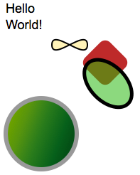
The root of the draw package is DrawComponent. DrawComponent is a component that provides a canvas-like area for visual elements. The scene of a DrawComponent is made up of sprites from the various types of geometric primitives rendered by the surface engine, ranging from ellipses to text.
DrawComponent component = new DrawComponent(600, 400);
Gradients are supported and can be used in place of any color attribute.
CircleSprite circle = new CircleSprite();
circle.setCenterX(30);
circle.setCenterY(100);
circle.setRadius(25);
Scaling scale = new Scaling();
scale.setX(2);
scale.setY(2);
circle.setScaling(scale);
circle.setStroke(new Color("#999"));
Gradient gradient = new Gradient("gradient", 21);
gradient.addStop(0, new Color("#79A933"));
gradient.addStop(13, new Color("#70A333"));
gradient.addStop(34, new Color("#559332"));
gradient.addStop(58, new Color("#277B2F"));
gradient.addStop(86, new Color("#005F27"));
gradient.addStop(100, new Color("#005020"));
circle.setFill(gradient);
component.addGradient(gradient);
circle.setStrokeWidth(3);
component.add(circle);
The PathSprite is the lowest level sprite element, and it allows the developer to manually set up the vector elements of a sprite. We have made the path system easier by using strongly typed PathCommands. PathSprite also provides useful helper functions such as line smoothing.
PathSprite path = new PathSprite();
path.addCommand(new MoveTo(75, 75));
path.addCommand(new CurveTo(0, -25, 50, 25, 50, 0, true));
path.addCommand(new CurveTo(0, -25, -50, 25, -50, 0, true));
path.setStroke(new Color("#000"));
path.setStrokeWidth(2);
path.setFill(new Color("#fc0"));
path.setFillOpacity(0.25);
component.add(path);
To better understand the new charting system, let’s walk through one of the examples.
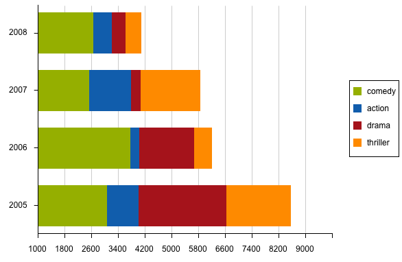
The data used in the chart is accessed from a store. In this example, ValueProviders are used to link the data to corresponding areas of the chart. A ValueProvider instance takes a model object and returns a value. Each Series is designed to accept a certain type of value and will only accept ValueProviders that supply that type. While you can implement your own ValueProvider instances, if your data model has getters and setters, you can define a PropertyAccess type to supply ValueProvider instances as needed. In this example, we are using the Movies class, which has several properties of type double, each with its own getter and setter. Each genre represents the number of releases for the given year. More on the ListStore configuration.
public interface MoviesPropertyAccess extends PropertyAccess<Movies> {
  ValueProvider<Movies, Double> action();
  ValueProvider<Movies, Double> comedy();
  ValueProvider<Movies, Double> drama();
  ValueProvider<Movies, Double> thriller();
  ValueProvider<Movies, Integer> year();
  ModelKeyProvider<Movies> yearKey();
}

private static final MoviesPropertyAccess moviesAccess = GWT.create(MoviesPropertyAccess.class);

@Override
public Widget asWidget() {
  final ListStore<Movies> store = new ListStore<Movies>(moviesAccess.yearKey());
  store.addAll(TestData.getMovieData(2005, 4, 0, 10000));

  final Chart<Movies> chart = new Chart<Movies>(600, 400);
  chart.setStore(store);
  chart.setChartShadow(true);
  chart.setAnimated(true);
  //...
}
Axes come in various types and are added to the chart on which they will appear. Only one axis can be used for each position on the chart. You then link ValueProviders from the store to provide the data sets that are used by the axis. This example also shows the configuration for the title, grid, and subtick steps. The NumericAxis will interpolate between the values in the store whereas the CategoryAxis will only use values in the store. Some charts require a special Axis that is unique to that chart - such as with Gauge and Radar, for example. More on the chart axes configuration.
NumericAxis<Movies> axis = new NumericAxis<Movies>();
axis.setPosition(Position.BOTTOM);
axis.addField(moviesAccess.comedy());
axis.addField(moviesAccess.action());
axis.addField(moviesAccess.drama());
axis.addField(moviesAccess.thriller());
axis.setDisplayGrid(true);
chart.addAxis(axis);

CategoryAxis<Movies> catAxis = new CategoryAxis<Movies>();
catAxis.setPosition(Position.LEFT);
catAxis.addField(moviesAccess.year());
chart.addAxis(catAxis);
The Legend provides a key of the data represented in the chart. The legend adapts to the series added to the chart and uses items that pertain to the type of data set represented in that series. A legend is an easy way for the end user to highlight or hide data in the chart.
Legend<Movies> legend = new Legend<Movies>();
legend.setPosition(Position.RIGHT);
chart.setLegend(legend);
A Series functions in a similar way to an Axis. Each series represents a different chart type, such as Pie or Radar. First, you add ValueProviders for accessing the data represented in the Series. Next, you add the colors associated with the Series. More on the chart series configuration.
BarSeries<Movies> bar = new BarSeries<Movies>();
bar.setyAxisPosition(Position.BOTTOM);
bar.addyField(moviesAccess.comedy());
bar.addyField(moviesAccess.action());
bar.addyField(moviesAccess.drama());
bar.addyField(moviesAccess.thriller());
bar.addColor(new RGB(148, 174, 10));
bar.addColor(new RGB(17, 95, 166));
bar.addColor(new RGB(166, 17, 32));
bar.addColor(new RGB(255, 136, 9));
bar.setStacked(true);
chart.addSeries(bar);
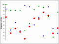
The advantage of separating the chart types into series, instead of making them a part of the chart itself, is that various chart types can be mixed together. In the example below, a Scatter, Line, and Bar Series are all used on the same chart.

Next, let’s run through all of the chart types in this preview and give a general overview of how they are used.
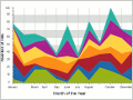
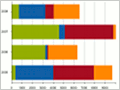
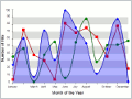
The stacked Area Chart is useful when displaying multiple aggregated layers of information.
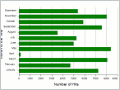
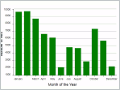
A Bar Chart is a useful visualization technique to display quantitative information for different categories that shows some progression (or regression) in the data set.
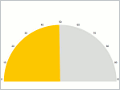
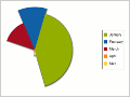
Gauge Charts are used to show progress in a certain variable.
A Line Chart is a useful visualization technique to display quantitative information for different categories or other real values (as opposed to the bar series), that can show some progression (or regression) in the data set.
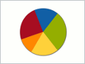
A Pie Chart is a useful visualization technique to display quantitative information for different categories that also have a meaning as a whole.
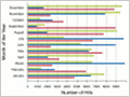
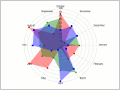
A Radar Chart is a useful visualization technique for comparing different quantitative values for a constrained number of categories.
The scatter plot is useful when trying to display more than two variables in the same visualization.
Be sure to try all of the examples—and in particular, the legend interactivity. This is just scratching the surface of what is possible with the new Draw and Charting framework. We can’t wait to see what you do with them.


 GXT | Terms of Use
