Demo App Inspection
Many classes have shortcut names used when creating (instantiating) a class with a
configuration object. The shortcut name is referred to as an alias (or xtype if the
class extends Ext.Component). The alias/xtype is listed next to the class name of
applicable classes for quick reference.
Framework classes or their members may be specified as private or protected. Else,
the class / member is public. Public, protected, and private are access
descriptors used to convey how and when the class or class member should be used.
Public classes and class members are available for use by any other class or application code and may be relied upon as a stable and persistent within major product versions. Public classes and members may safely be extended via a subclass.
Protected class members are stable public members intended to be used by the
owning class or its subclasses. Protected members may safely be extended via a subclass.
Private classes and class members are used internally by the framework and are not intended to be used by application developers. Private classes and members may change or be omitted from the framework at any time without notice and should not be relied upon in application logic.
static label next to the
method name. *See Static below.Below is an example class member that we can disect to show the syntax of a class member (the lookupComponent method as viewed from the Ext.button.Button class in this case).
Let's look at each part of the member row:
lookupComponent in this example)( item ) in this example)Ext.Component in this case). This may be omitted for methods that do not
return anything other than undefined or may display as multiple possible values
separated by a forward slash / signifying that what is returned may depend on the
results of the method call (i.e. a method may return a Component if a get method calls is
successful or false if unsuccessful which would be displayed as
Ext.Component/Boolean).PROTECTED in
this example - see the Flags section below)Ext.container.Container in this example). The source
class will be displayed as a blue link if the member originates from the current class
and gray if it is inherited from an ancestor or mixed-in class.view source in the example)item : Object in the example).undefined a "Returns" section
will note the type of class or object returned and a description (Ext.Component in the
example)Available since 3.4.0 - not pictured in
the example) just after the member descriptionDefaults to: false)The API documentation uses a number of flags to further commnicate the class member's function and intent. The label may be represented by a text label, an abbreviation, or an icon.
classInstance.method1().method2().etc();false is returned from
an event handler- Indicates a framework class
- A singleton framework class. *See the singleton flag for more information
- A component-type framework class (any class within the Ext JS framework that extends Ext.Component)
- Indicates that the class, member, or guide is new in the currently viewed version
- Indicates a class member of type config
- Indicates a class member of type property
- Indicates a class member of type
method
- Indicates a class member of type event
- Indicates a class member of type
theme variable
- Indicates a class member of type
theme mixin
- Indicates that the class, member, or guide is new in the currently viewed version
Just below the class name on an API doc page is a row of buttons corresponding to the types of members owned by the current class. Each button shows a count of members by type (this count is updated as filters are applied). Clicking the button will navigate you to that member section. Hovering over the member-type button will reveal a popup menu of all members of that type for quick navigation.
Getting and setter methods that correlate to a class config option will show up in the methods section as well as in the configs section of both the API doc and the member-type menus just beneath the config they work with. The getter and setter method documentation will be found in the config row for easy reference.
Your page history is kept in localstorage and displayed (using the available real estate) just below the top title bar. By default, the only search results shown are the pages matching the product / version you're currently viewing. You can expand what is displayed by clicking on the button on the right-hand side of the history bar and choosing the "All" radio option. This will show all recent pages in the history bar for all products / versions.
Within the history config menu you will also see a listing of your recent page visits. The results are filtered by the "Current Product / Version" and "All" radio options. Clicking on the button will clear the history bar as well as the history kept in local storage.
If "All" is selected in the history config menu the checkbox option for "Show product details in the history bar" will be enabled. When checked, the product/version for each historic page will show alongside the page name in the history bar. Hovering the cursor over the page names in the history bar will also show the product/version as a tooltip.
Both API docs and guides can be searched for using the search field at the top of the page.
On API doc pages there is also a filter input field that filters the member rows using the filter string. In addition to filtering by string you can filter the class members by access level, inheritance, and read only. This is done using the checkboxes at the top of the page.
The checkbox at the bottom of the API class navigation tree filters the class list to include or exclude private classes.
Clicking on an empty search field will show your last 10 searches for quick navigation.
Each API doc page (with the exception of Javascript primitives pages) has a menu view of metadata relating to that class. This metadata view will have one or more of the following:
Ext.button.Button class has an alternate class name of Ext.Button). Alternate class
names are commonly maintained for backward compatibility.Runnable examples (Fiddles) are expanded on a page by default. You can collapse and expand example code blocks individually using the arrow on the top-left of the code block. You can also toggle the collapse state of all examples using the toggle button on the top-right of the page. The toggle-all state will be remembered between page loads.
Class members are collapsed on a page by default. You can expand and collapse members using the arrow icon on the left of the member row or globally using the expand / collapse all toggle button top-right.
Viewing the docs on narrower screens or browsers will result in a view optimized for a smaller form factor. The primary differences between the desktop and "mobile" view are:
The class source can be viewed by clicking on the class name at the top of an API doc page. The source for class members can be viewed by clicking on the "view source" link on the right-hand side of the member row.
If you followed the Connecting Demo App guide, the DemoClient application should now be displayed in Sencha Inspector.
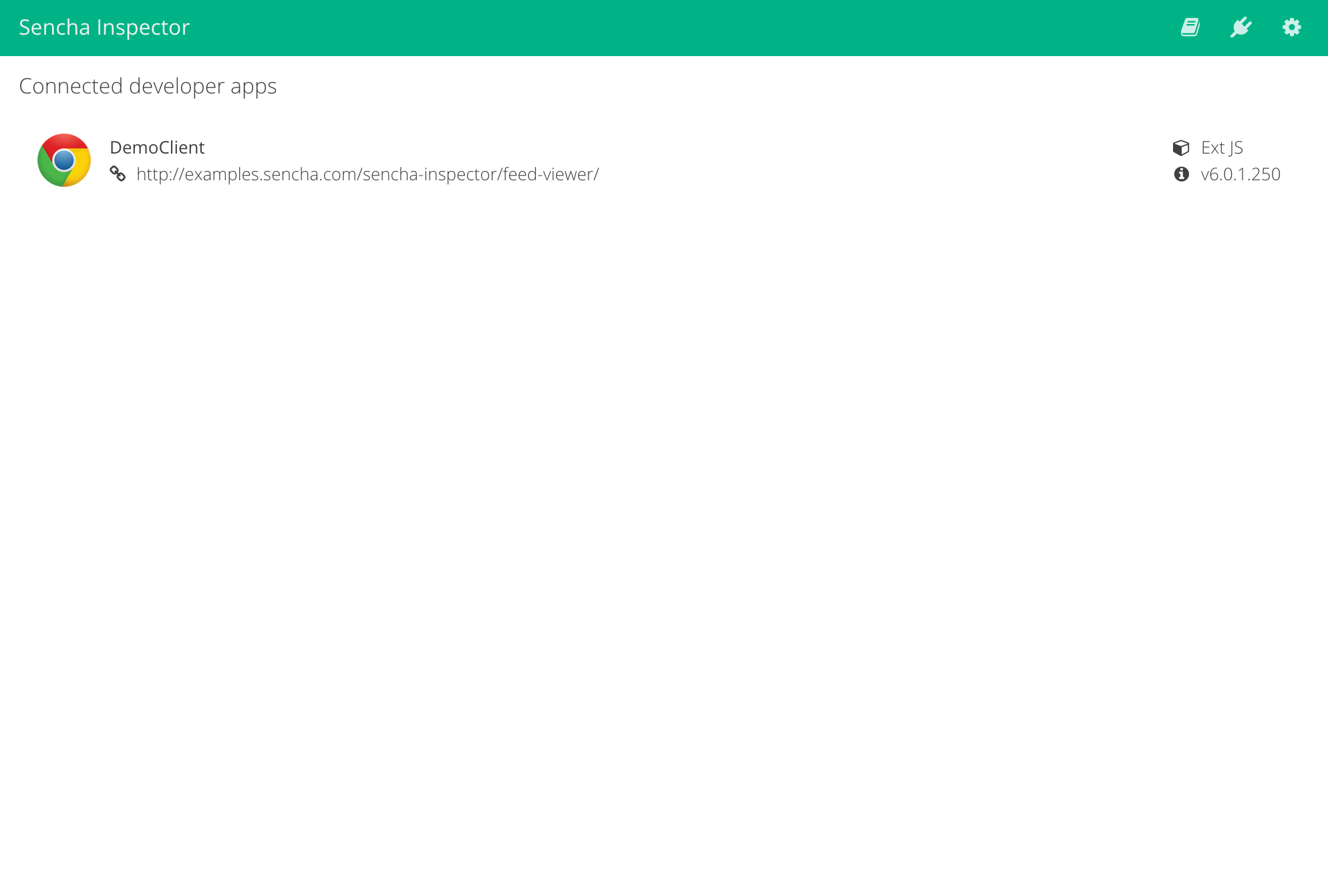
Click on Demo Client to inspect it. This will open up the inspection window.
Before we dive into the application itself, let’s look at some of its basic information.
Click on the last tab, App Details, and you should see the following:
Browser and Version.
Ext JS, Toolkit, and Cmd versions.
Other information such as theme, license, etc.
This is vital information for filing support tickets, asking questions in the Sencha Forums, or simply confirming certain assumptions you may have about an application.
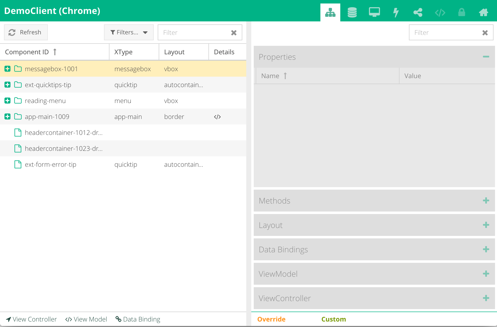
Next, click on the first tab, Components.
On the left side you should see all of the components currently available in the application. On the right, you'll see properties, methods, and other information about each selected component.
In most cases, you'll want to find a specific component in the tree. You can drill-down into the tree manually, or search for a component's ID or xtype using the filter box.
You can even use the pre-defined filters for specific things like finding components with layout problems or for finding components that utilize ViewModels, ViewControllers, or Data Binding.
Let's walk through a couple examples.
As an example, the application contains an instance of the feedlist class (DemoClient.view.feed.List). This class
demonstrates an over-nested layout.
To find it, select the pre-defined filter for "Layout Errors". Next, drill down into the tree to find a component with xtype feedlist
that has its layout highlighted in red.
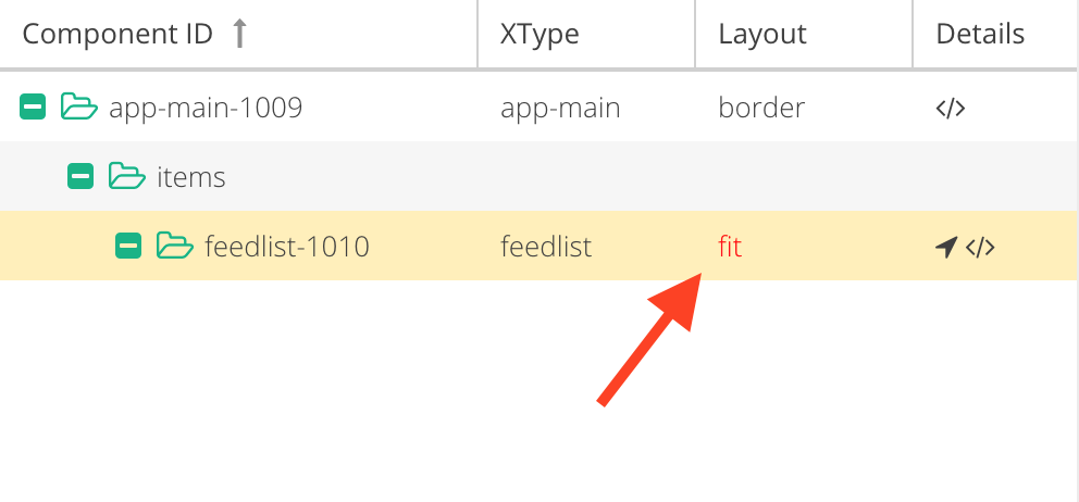
Hover your mouse over the highlighted text to see the error. You should see a brief explanation about why this component reports an error in the layout.
In this particular case, feedlist is a component utilizing a "fit" layout. However, if you clear the
filter, you'll notice that its only child is a grid. Sencha Inspector is merely pointing out the fact that feedlist is
wrapping a grid without adding any additional layout functionality. This typically indicates that the grid may
be over-nested).
Note: Sencha Inspector identifies patterns that may result in known performance or layout problems. This does not always mean that a problem actually exists.
Next, let's use the filter box to find an instance of feedpost. Click on the component in the tree, then begin exploring its ViewController.
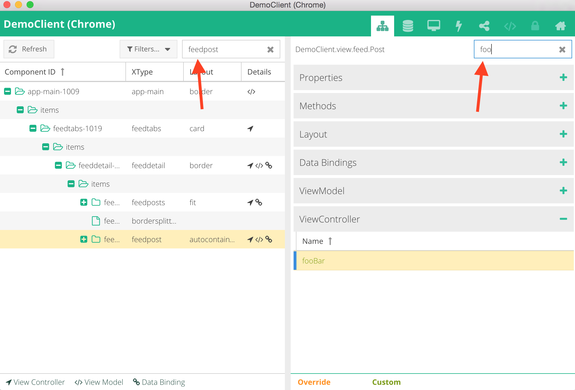
If you filter the component's details using the text "foo", you'll see fooBar() listed under the ViewController panel.
You may notice that its color is different from other items in the ViewController method list. It appears in green text because
this method was defined on this class. It would display differently if it had been inherited from a parent class.
Next, clear the filter and open the ViewModel panel. You will notice that several of the properties defined on the ViewModel are experiencing errors. For example, "link" has not been assigned a value!
If you open the Data Bindings panel, you'll see another error. In this case, the value bound to "collapsible" is {feeed}.
As you can see, this bind is is misspelled, as it should have been {feed}.
Next, let's click on the "Stores" tab.
In the upper-left, you should see the stores that are currently available in the application. Choose one of the stores in the list.
You can now explore the store's basic configuration, model, and proxy information. In the lower-left grid, you can choose a record and then explore its raw data in the lower-right grid.
Next, click on the "Layout Runs" tab.
Click “Watch” and then switch into your browser. Begin interacting with the application. When you return to Sencha Inspector, you should see that several layout runs have been logged.
In Ext JS, the page and component layouts are managed by the framework using JavaScript. Anytime a component is added, removed, or resized, the framework needs to recalculate layouts. The obvious implication is that performance problems might occur if the framework needs to spend long CPU cycles recalculating the sizes and positions of components.
Opening up a layout run, you can see exactly what components are affected. You can even select one that has an xtype and click “Reveal”. This will provide you with more information about the component in the tree.
Next, click on the "Events" tab.
Similarly, Sencha Inspector allows you to watch events fire during application runtime as well.
Click “Watch” and then switch into your browser. Begin interacting with the app and then return to Sencha Inspector. You
should see that a variety of events have been logged. These are all events fired in the application including both component
and Ext.Element events.
Many events will fire as you interact with the application. You can filter out a lot of noise by selecting "Filter Mouse Events", which will hide events such as "itemmouseenter", "mouseout", and many more.
Finally, click on the "App Architecture" tab.
Very often it will be useful to see if certain classes have been loaded in the app at any given time. You may explore the application architecture by manually expanding the tree, or by filtering the list.


 Sencha Inspector | Terms of Use
