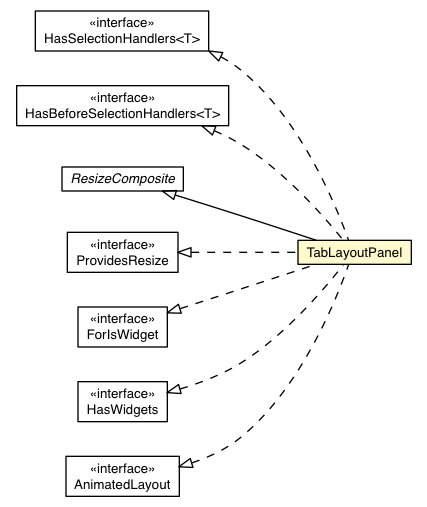
Class TabLayoutPanel


public static class TabLayoutPanel
extends Object
This widget will only work in standards mode, which requires that the HTML page in which it is run have an explicit <!DOCTYPE> declaration.
A TabLayoutPanel element in a UiBinder template must have a barHeight attribute with a double
value, and may have a barUnit attribute with a
Style.Unit value.
barUnit defaults to PX.
The children of a TabLayoutPanel element are laid out in <g:tab>
elements. Each tab can have one widget child and one of two types of header
elements. A <g:header> element can hold html, or a <g:customHeader>
element can hold a widget. (Note that the tags of the header elements are
not capitalized. This is meant to signal that the head is not a runtime
object, and so cannot have a ui:field attribute.)
For example:
 <g:TabLayoutPanel barUnit='EM' barHeight='3'>
  <g:tab>
    <g:header size='7'><b>HTML</b> header</g:header>
    <g:Label>able</g:Label>
  </g:tab>
  <g:tab>
    <g:customHeader size='7'>
      <g:Label>Custom header</g:Label>
    </g:customHeader>
    <g:Label>baker</g:Label>
  </g:tab>
 </g:TabLayoutPanel>
Copyright © 2018. All rights reserved.